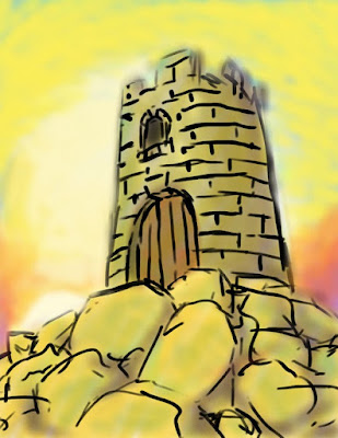
 This was the first time I used Corel to this extent. It came out of the curious request of my youngest cousin, Sofia, when she asked me to show her the program after saying it imitated paint. She watched me do the whole thing, ordering me around here and there. It was actually very fun and I got a huge laugh out of it.
Monday, December 27, 2010
 This was the first time I used Corel to this extent. It came out of the curious request of my youngest cousin, Sofia, when she asked me to show her the program after saying it imitated paint. She watched me do the whole thing, ordering me around here and there. It was actually very fun and I got a huge laugh out of it.
Thursday, December 16, 2010
Influence Map
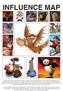 I'm a huge fan of character design, and Nico Marlet (sketch in middle) is one of my favorite designers. He works at DreamWorks Animation studio as one of their top character sketch artists, having worked on films including Kung Fu Panda and How to Train Your Dragon.
His work (to me) feels completely unrestrained, free flowing, and very individual, with strong shapes and rich textural design. He turns a sketch into a work of art.
The larger squares illustrate principals of character design I value including:
- Function
- Design &
- Personality
Some favorite & highly stylized games: Viewtiful Joe, Legend of Zelda: Windwaker, Luigi's Mansion, amongst others.
With animation, I love to see more experimentation being done successfully. Cloudy with a Chance of Meatballs proved to be a very unique 3d (cg) animated film in that it had the vitality of a cartoon, filled with spontaneous energy and unpredictability. Animation has the power to create impossible worlds! Don't limit yourself to techniques and mediums. The more you explore, the more possibilities you open.
Wednesday, December 15, 2010
Helmet Boy: Color Test
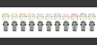
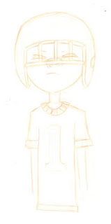 I'm gonna try to post a pdf process document to download. Refer to my Sketchbook blog to see more on the concept.
Recently I've been playing around in Illustrator and I've been really enjoying it, so expect more illustrator pieces ahead! This is exciting!!!
Saturday, December 11, 2010
Noah Project
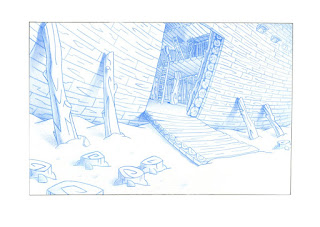
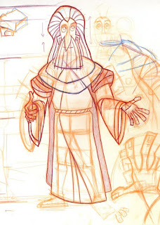
This project started off as a sequential assignment in which we had to create character, scene, and storyboard of Bill Cosby's "Take on Noah" comedic skit. I doubled the assignment for animation class- to animate a character with dialogue. Little did I know that animating to Bill Cosby was going to be super tough! (Tip: start animating to simple/limited dialogue)
Tuesday, December 7, 2010
Toon Layout
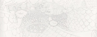
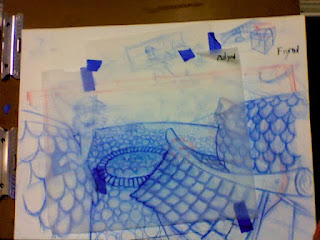
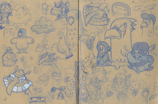 I've never really done much layout/environment work before this project, so diving into this assignment was a BLAST! The goal was to create a setting and later place 12 character within the space. I saw the opportunity to create my own cartoon world, and thus Sky World was hatched.
I apologies for not having the final result. Here we see the final penciling of the layout, the rough (blue), and my sketchbook page of characters.
This project was tough because I'm normally used to drawing characters versus environments which include more technical perspective. From the blue rough you can see I used many sheets for just about everything (I think there was about 4-5 different layers...there a torn transparency just for the sign!). By the end of it all, I learned a lot of what NOT to do.
tips:
- don't get caught up in detail (first use large shapes/ geometry)
- DO: draw on smaller dimensions (thumbnail perspective), then work final bigger
- DO: finally, think about composition in relationship of both characters and layout
Sunday, December 5, 2010
Kitchen
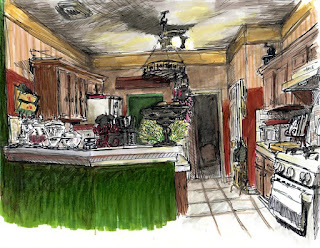
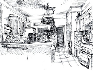 Lately, I've been drawing environments to help on layout. This was a straight ahead ink pen sketch on laser print paper, later colored with Prismacolor marker.
I really enjoyed this exercise. It was spontaneous and fun. I got to see how the collection of props, and color give a room a mood & character, in addition to how certain objects can draw more personality than others (like the stove).
Saturday, December 4, 2010
Cafe Chairs
Some more Chairs
Thursday, December 2, 2010
Props & environments 1
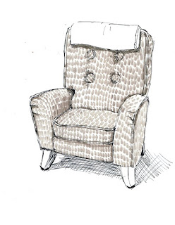
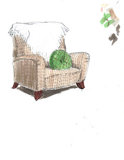
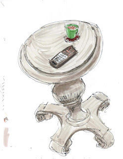 So part of this Winter break, I plan on studying more layouts and (here) props, which play an important elements in backgrounds and characters.
Layout artists are incredible. They need both a sense of cinematography and animation to know how to go about designing the layout in which both the camera and characters take motion.
Here I did caricatures of furniture, some more loose than others. I used Hammermill Color Laser Gloss paper, with ink pens and prisma markers.
I really enjoyed the effect the markers on this paper achieves. They dry very quickly so you see the strokes. This with the ink pens made it great for spontaneous caricatures.
Wednesday, December 1, 2010
Foundation: figures
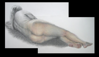
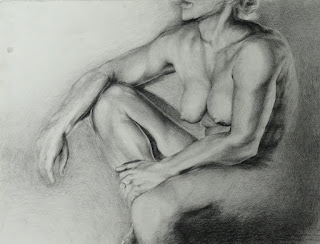 Figure drawings (2nd year - SCAD).
SCAD has a lot of great professors that allow you to explore your own ideas, while helping along the way. Professor Pain was one of them. (Work on top) Still using the one sheet of 18"x24", I decided to cut it in two to best fit the whole figure, allowing me to draw bigger. We had to implement the limited color pallet provided (peach, blue, and red pastel), so i decided to use it as both an element of focus, and use of more red in weak or overused areas of the body/figure (including foot, knee joint, between the thighs) to give the drawing some sense of a tale.
Tuesday, November 30, 2010
Monday, November 29, 2010
Adam and Eve
I worked on this short during Freshman year with two other buddies (including my good friend Xavier- see his stuff at: theartofxavier.blogspot.com).
It was another fun animation project, and my first legitimate stop-motion, after my lego studios adventures ever since I was a very small child.
Post Numero Uno!
I thought to start with a fun little animation I did in SCAD (Savannah Collage of Art and Design).
I'm studying to become an AWESOME animator with powers of AWESOME greatness to create AWESOMENESS!!!!
To summarize, I want to use animation to entertain and to touch hearts, arise laughter, and bring togetherness of all people, all ages.
Growing up, I've been influenced by much animation, the main ones being Disney movies and T.V. cartoons. I've valued the family aspect of animation ever since, continuing to look up at studios like PIXAR Animation Studios and DreamWorks for their contribution.
However, animation is far more than a family entertainment. I love it for its infinite possibilities. I value it's ability to target individual audiences as well as large, in addition to its many forms it can take.
As a wise professor once told me, "It's an Art of Impossible Worlds." (~ Professor Charles DaCosta)
Subscribe to:
Comments (Atom)


